Friday, November 5, 2010

New ECOLOGY GRAFFITI

When the walls to cover them with grafitty , exhausting all .... then the snail, is a nice beginning.!!

what do you think?

L.A.'s CleanTech corridor


October 8, 2010
Umbrella
Visions are developing of what the proposed CleanTech Corridor might look like when it eventually begins to emerge in downtown Los Angeles.
The Southern California Institute of Architecture launched a competition that invited entrants to reconceptualize the crumbling, 4-mile stretch of land adjacent to the Los Angeles River. The school, known as SCI-Arc, announced more than $10,000 in prizes Friday for the winners.
The city-run Community Redevelopment Agency has also asked companies to submit proposals by Dec. 3 for revitalizing a 20-acre section of the corridor.
Los Angeles officials, including Mayor Antonio Villaraigosa, have long planned to convert the dilapidated area into a booming and innovative clean technology district. Proponents imagine the area as an incubator for start-ups and an industrial park stuffed with jobs-providing and environmentally sustainable companies.
SCI-Arc’s campus is a former freight depot sitting in the planned 2,000-acre CleanTech Corridor space.
“We live in this district and we want a voice in the discussion, a dog in the fight,” said Peter Zellner, a program coordinator at the school. “Until now, it’s been focused from 10,000 feet in the air. We want to talk about the impact on the ground.”
The competition, co-sponsored by The Architect’s Newspaper, attracted 70 entries from 11 countries, including China, Germany and Russia. Jurors including working architects, Princeton University’s architecture dean, a representative from the Los Angeles County Metropolitan Transportation Authority and a Los Angeles deputy mayor.
Participants included landscape architects, urban planners, designers, engineers, environmental professionals and students.
A team from Oslo with a project named “UMBRELLA” won $5,000 in the professional category. Constantin Boincean, Ralph Bertram and Aleksandra Danielak envisioned mushroom-like structures that look like massive street art but are actually solar-powered evaporators.
Through a system of evaporation and condensation, the structures would collect and clean up water from the sewage system and distribute it through city streets to create lush, green urban landscapes.
Students from the architecture school at the University of Virginia were awarded $2,000 for their MessyTECH project. Randall Winston, Jennifer Jones and Renee Pean suggested a flexible, local infrastructure using solar and wind power as well as treated water gathered from community sites.
Winners will be feted at a community celebration at the SCI-Arc campus at 2 p.m. on Saturday and then featured in an on-site exhibition until Oct. 27.
Messytech
-- Tiffany Hsu
Photos: Excerpts of the winning proposals. UMBRELLA project (top) and MessyTECH (bottom). Credit: SCI-Arc.
also see more,,,http://www.dexigner.com/news/21608

Gallery | adaptivereuse.net


Garage To House

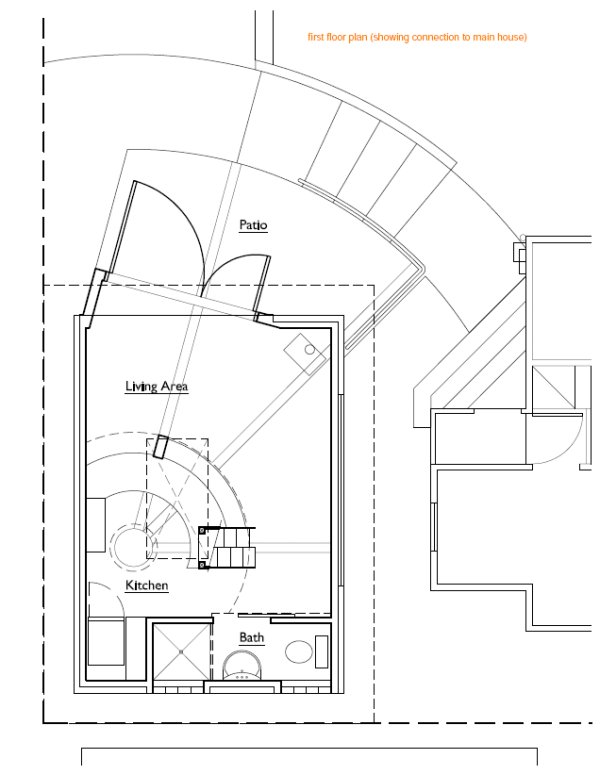
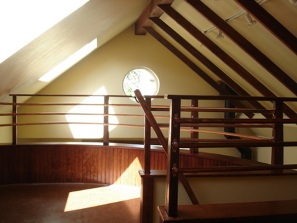
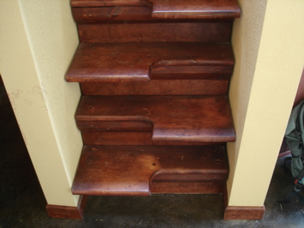
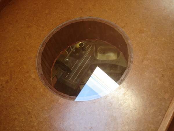
This garage adaptively reused as a tiny house of 400 square feet is in the Mt. Tabor neighborhood of Portland, Oregon. It features a mezzanine bedroom, alternating steps staircase and plexiglass porthole in the mezzanine floor lighting the kitchen below, a typically well thought out detail.
garage house
garage house
garage house
garage house
garage house
garage house
The blog tells a fascinating tale of the bureaucratic perils that lay in wait for anyone trying to build small in a world of bloat.
read more.....
Gallery | adaptivereuse.net

The Covers behind the Cover of Marian Bantjes' New Book: Observatory: Design Observer

READ MORE.........
The Covers behind the Cover of Marian Bantjes' New Book: Observatory: Design Observer


Marian Bantjes & Jessica Helfand

The Bantjes Covers


There are designers who draw, and designers who think; designers whose knowledge of historical form both enhances and frames the work they make; and designers who make things that oblige us to reconsider the history — and the future — within which their work resides. There are designers whose technical virtuosity raises the bar, catapulting us all into an entirely new stratosphere — not unlike the way fluency in a foreign language reshapes our phrasing and our cadences, our idioms and our gestures. There are designers who work hard, wickedly hard, because they love what they do and they are what they do.


And then there is Marian Bantjes, who is all of this. She's a visual contortionist whose ideas about space and shape know no limits. Hers is a lofty, loopy love affair with typography and pattern and color: with them, she plays and inverts, flips and subverts, twists and turns and reinvents the world. In this as in so many things, she is utterly fearless. She's also her own worst critic — tireless and critical about not only what she makes but how she makes it.


What follows is her own step-by-step process to produce the cover for her new book, I Wonder, recently published by Monacelli and Thames & Hudson: it's an expository monologue, in which Bantjes reflects and rejects iteration upon iteration until she finds an acceptable solution.


Acceptable to whom? In an age in which everyone claims to be a designer, Bantjes' approach lies somewhere between perfectionism and fetishism. Which is, by the way, the whole point.


— Jessica Helfand


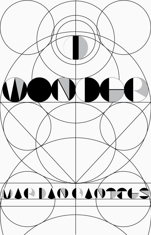
Cover 1a
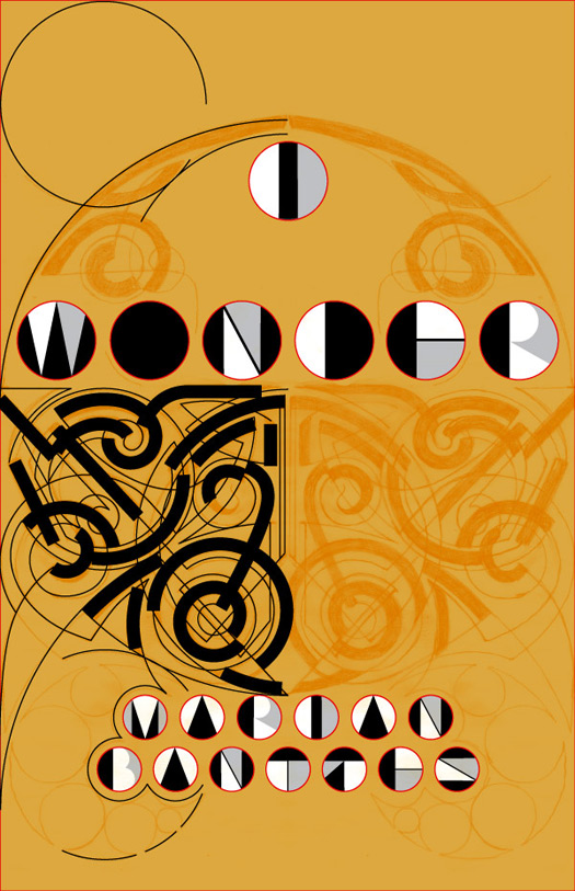
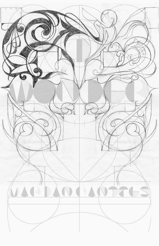
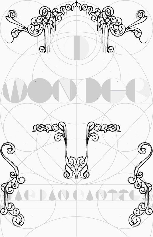
I started with a basic template: this was a grid for me to work from. I wanted to juxtapose a "modern" design with an ornamental one.


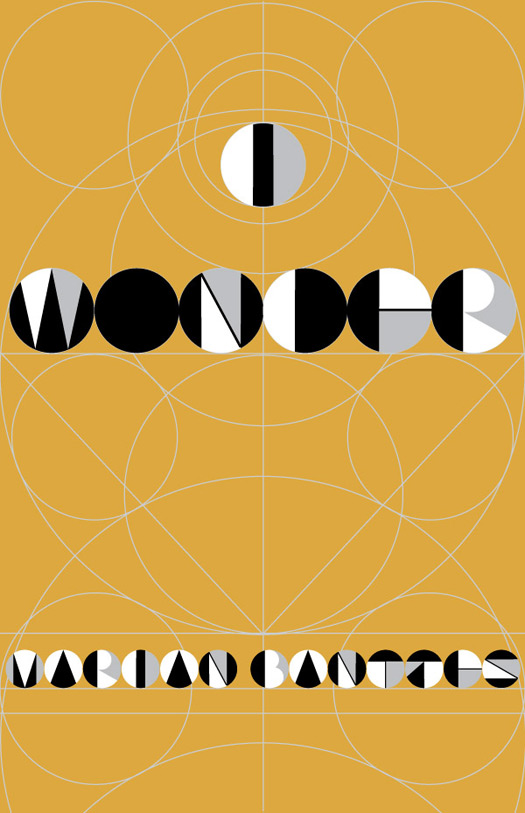
Cover 1b
My intent was that the cover would be printed with two golds and a silver: so quite subtle in the ornament. And then there would be round holes punched in the cover which would see through to a fly-page behind. That page would be an array of gemometric lines and shapes in white, black and silver and the letterforms would not be that evident on the page itself, unless viewed through the holes on the front. I knew this was risky, but ...


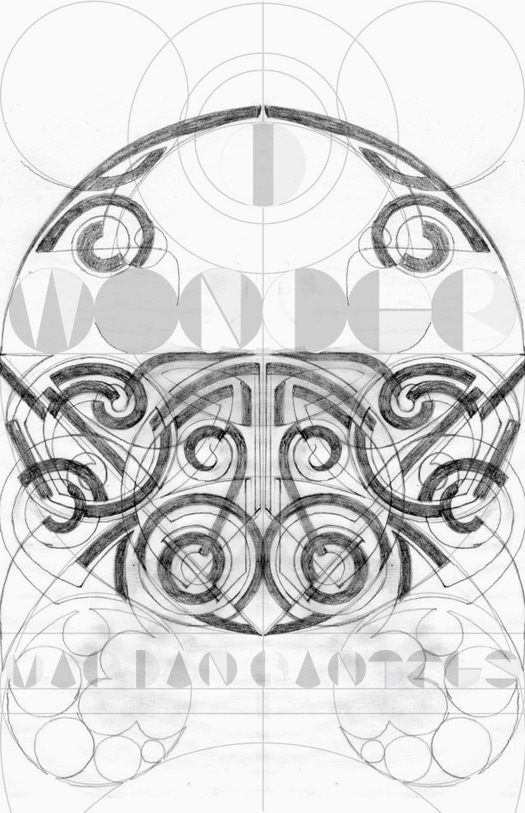
Cover 2a


This is my first sketch for the design. I was uncertain about it ...


Cover 2b
But I decided to take it into Illustraor for a trial. I decided it looked too Celtic.


Cover 3


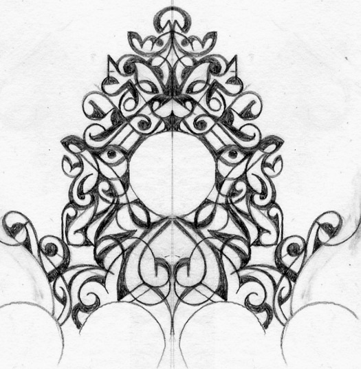
Moving away from Celtic and into Rococo, it seemed just too obviously swirly.


Cover 4
Attempting to introduce some of my signature straights + curves ... but this reminded me of a Baroque clock ...


Cover 5


I'm not sure what I was thinking. Clearly I didn't think it through for very long. I decided to turn to patterns, and bring the cover into full-color + gold.


READ MORE.........
Related Posts Plugin for WordPress, Blogger...

amazon