
READ MORE.........
The Covers behind the Cover of Marian Bantjes' New Book: Observatory: Design ObserverThe Bantjes Covers
There are designers who draw, and designers who think; designers whose knowledge of historical form both enhances and frames the work they make; and designers who make things that oblige us to reconsider the history — and the future — within which their work resides. There are designers whose technical virtuosity raises the bar, catapulting us all into an entirely new stratosphere — not unlike the way fluency in a foreign language reshapes our phrasing and our cadences, our idioms and our gestures. There are designers who work hard, wickedly hard, because they love what they do and they are what they do.
And then there is Marian Bantjes, who is all of this. She's a visual contortionist whose ideas about space and shape know no limits. Hers is a lofty, loopy love affair with typography and pattern and color: with them, she plays and inverts, flips and subverts, twists and turns and reinvents the world. In this as in so many things, she is utterly fearless. She's also her own worst critic — tireless and critical about not only what she makes but how she makes it.
What follows is her own step-by-step process to produce the cover for her new book, I Wonder, recently published by Monacelli and Thames & Hudson: it's an expository monologue, in which Bantjes reflects and rejects iteration upon iteration until she finds an acceptable solution.
Acceptable to whom? In an age in which everyone claims to be a designer, Bantjes' approach lies somewhere between perfectionism and fetishism. Which is, by the way, the whole point.
— Jessica Helfand
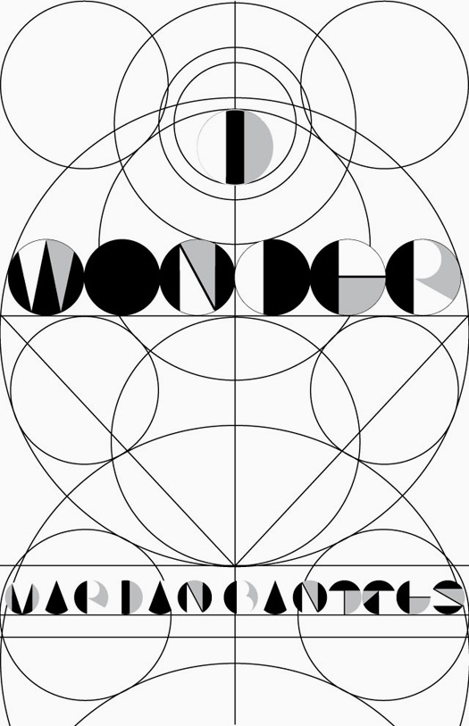
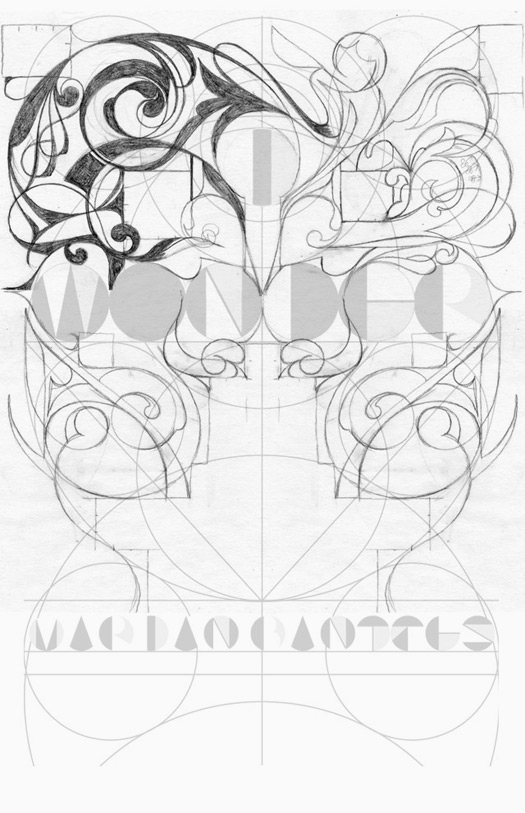
Cover 1a
I started with a basic template: this was a grid for me to work from. I wanted to juxtapose a "modern" design with an ornamental one.
I started with a basic template: this was a grid for me to work from. I wanted to juxtapose a "modern" design with an ornamental one.
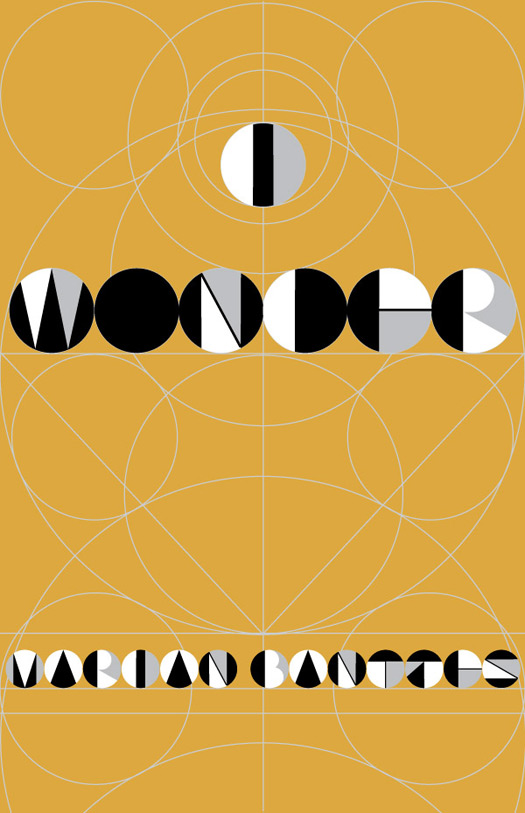
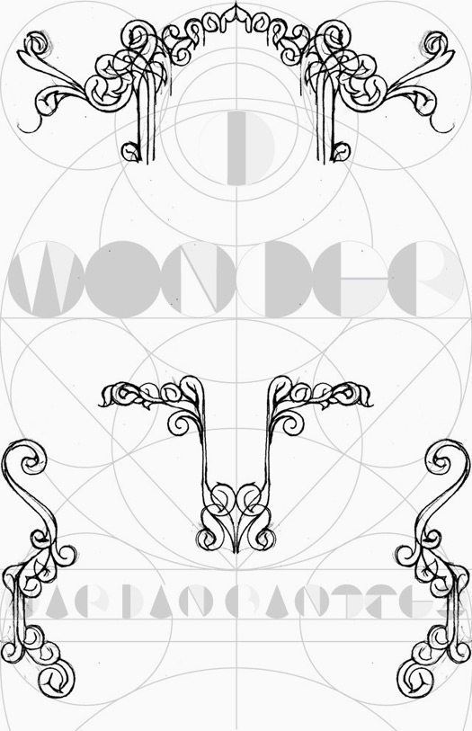
Cover 1b
My intent was that the cover would be printed with two golds and a silver: so quite subtle in the ornament. And then there would be round holes punched in the cover which would see through to a fly-page behind. That page would be an array of gemometric lines and shapes in white, black and silver and the letterforms would not be that evident on the page itself, unless viewed through the holes on the front. I knew this was risky, but ...
My intent was that the cover would be printed with two golds and a silver: so quite subtle in the ornament. And then there would be round holes punched in the cover which would see through to a fly-page behind. That page would be an array of gemometric lines and shapes in white, black and silver and the letterforms would not be that evident on the page itself, unless viewed through the holes on the front. I knew this was risky, but ...
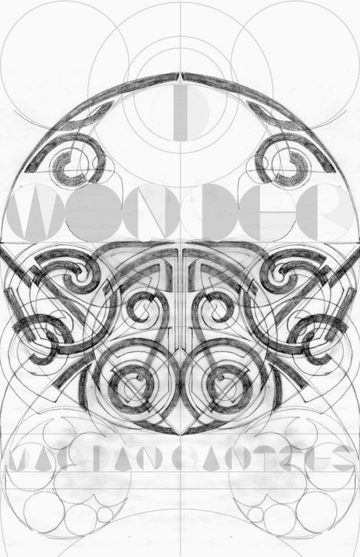
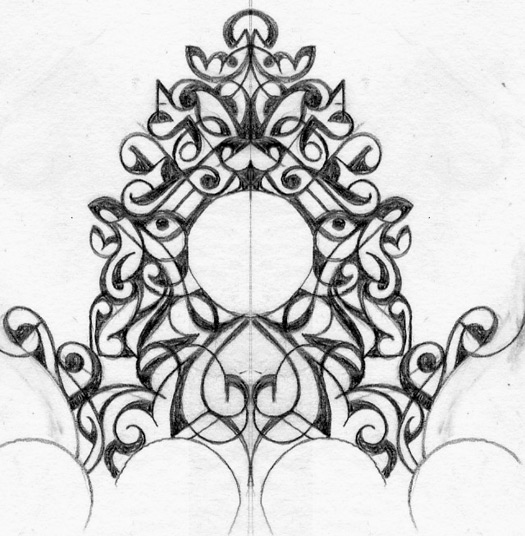
Cover 2a
This is my first sketch for the design. I was uncertain about it ...
This is my first sketch for the design. I was uncertain about it ...
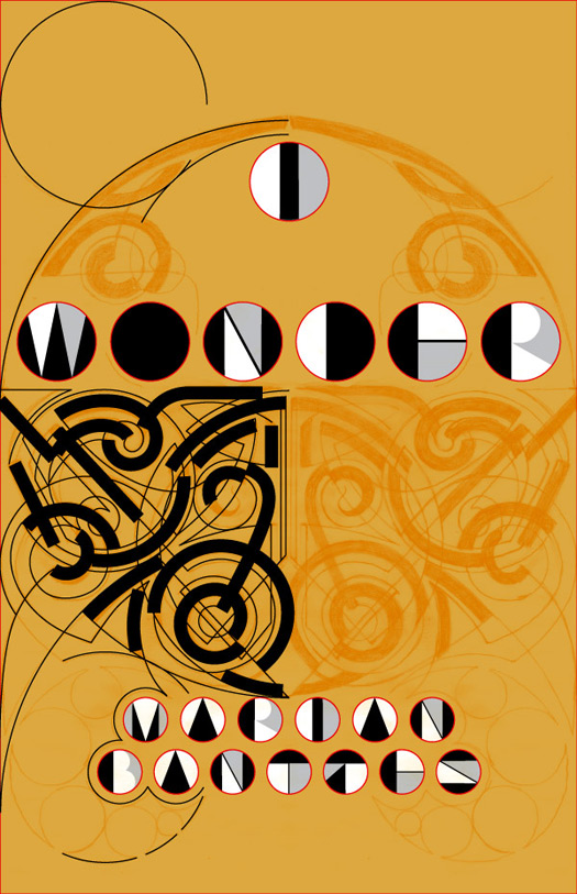
Cover 2b
But I decided to take it into Illustraor for a trial. I decided it looked too Celtic.
But I decided to take it into Illustraor for a trial. I decided it looked too Celtic.
Cover 3
Moving away from Celtic and into Rococo, it seemed just too obviously swirly.
Moving away from Celtic and into Rococo, it seemed just too obviously swirly.
Cover 4
Attempting to introduce some of my signature straights + curves ... but this reminded me of a Baroque clock ...
Attempting to introduce some of my signature straights + curves ... but this reminded me of a Baroque clock ...
Cover 5
I'm not sure what I was thinking. Clearly I didn't think it through for very long. I decided to turn to patterns, and bring the cover into full-color + gold.
I'm not sure what I was thinking. Clearly I didn't think it through for very long. I decided to turn to patterns, and bring the cover into full-color + gold.
READ MORE.........
0 σχόλια:
Post a Comment